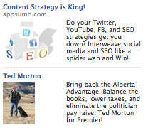
It’s a fact. Your image selection for Facebook ads are an integral and important part to generating interest and clicks on your ads. Good copy and titles are imperative, but images are what draw the eye. So with only 110 x 80 pixels to work with, what are some rules to follow, and classic mistakes to avoid. In this article we’ll cover five classic Facebook ad image mistakes to avoid, and provide you with some tips to really take advantage of for your Facebook campaigns.
Throughout this article we have examples of the good and bad images out there. Which are which, should be obvious after reading this post.
1) Avoid Unrecognizable Images
 If your image it’s easily identifiable, or encourages “squinting” you haven’t done your job as an advertiser. This is likely the most common fault for advertisers on Facebook, the image may be easily identifiable to them, but not to the people they are trying to market to… this is a mistake. Simple, easy to see images are a must. If you can’t think of a way to advertise your product/cause/event with an image that anyone, and we mean anyone, can “get” – your click-through-rates and results will suffer.
2) Avoid Any and All Facebook Colors
 Using Facebook colors is an easy way to make your ads blend in to the background. Compared to ads on Google’s network which can be as large as 160 x 600 pixels, Facebook’s are tiny. You need to pack an attention-grabbing punch in your ad to get the right eyes looking at your ads. If you use colors that are akin to Facebook, you will not stand-out, you will not get results, and you will be wasting money.
3) Think Simple
 Get to the point with your ads. Have a clear connection between your image and the content within it. If the image is not clear, or can’t tie into what you’re trying to sell easily – you will get the wrong people clicking your ads, costing your money.
4) Make it Pop
 Facebook might only give you 110 x 80 pixels for your images, but that doesn’t mean your options for standing out are limited. Not all Facebook advertisers (if I do say so myself) are that creative, nor do they understand the online advertising world. In our experience, the ads that perform best, are those that use clever, eye-grabbing images. Yes, titles and ad copy help, but nothing performs better than an interesting image. Here’s some tips to make your ads pop on Facebook:
- Think outside the 110 x 80, not every ad has to be a perfect rectangle. But don’t get lazy, and just not bother to crop your images.
- Facebook has a white background, which means you can use shadows to your advantage. Ads that look like stickers, or that appear to pop off the page will get more clicks.
 Round ads
- Fraying the edges of your ads
- Playing with colors – red is always a great color to get attention, and even black & white also works well.
- Experimentation to see what works for you.
5) Limit or Remove Text
 You have little picture space, and plenty of text space. Don’t fill up your image with text (unless it is text), if you can. Using text in your image will fight for the attention with the title – and this is not good advertising. Use your image space wisely, and you’ll see better results.
What are your thoughts? Do you have other unwritten rules on Facebook ads? We’d love to hear them – feel free to share in the comments below.
Recent Posts
Navigating the Digital Buying Cycle: Strategies for Modern Consumers
In today’s fast-paced world, where information is just a tap away, the buying cycle has transformed dramatically. Gone are the days when consumers...
Digital Marketing Strategies in the Off-Season
Ah, the off-season. For some businesses, it’s a time to kick back, relax, and sip on a well-deserved latte. For others, it’s a...
How ChatGPT is Transforming Online Search Behaviour
In the ever-evolving landscape of digital information, the way we search for answers is undergoing a seismic shift. We got used to searching...


