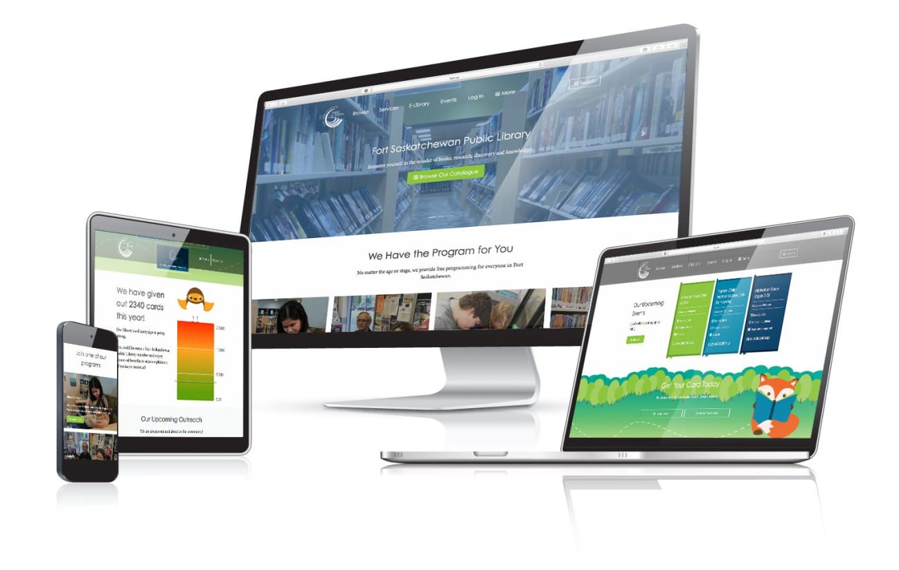
Our team recently launched a new website for the Fort Saskatchewan Public Library. The ‘FSPL’ is a recognized entity in the Fort Saskatchewan community providing access to thousands of useful library resources and services to the city’s residents.
Opportunity
We were given the opportunity to redesign the existing Fort Saskatchewan Public Library website with the approach of “not your typical library website.” Both the team at FSPL and Strong Coffee came into the project with an open mind and everyone involved was pleased with the outcome.
Some of the key areas of focus for this project included:
- Redesigning the website by integrating the recently developed ‘Get Your Card’ campaign graphics and colours to help create a uniquely identifiable brand online.
- Segmenting content based on the interests making the website easier to navigate for audiences to find information quickly.
- Leveraging imagery from day to day activities in the library to capture the true essence of the interaction between the facility and the residents of Fort Saskatchewan.
- Prioritize third-party integration for seamless display of information.
- From the client perspective, making the website easier to update for staff to add, change or swap out information quickly.
Approach
We aimed to create a visually appealing but uniquely different library website. Something that could stand out without compromising on user experience.
For the main colours of the website, we turned to the existing campaign graphics used in the library for inspiration so that there was a clear connection between online and offline branding.
We created various styled components in custom templates that included styled lists, image carousels, highlight sections and more to make it easy to add new pages to the website that would adopt the same look and feel as the rest of the site. These sections were also created with the ability to reorder them in any manner.
To make the website easier to navigate, we segmented the audiences into four main groups – Children, Teens, Adults, and Newcomers to Canada. To facilitate this, we made these audience types ‘featured’ sections high up on the homepage and included them in the secondary navigation.
We made a standardized call to action an optional feature of each page template and easily updatable to align with the client’s goals at any given time.
We added functionality that integrated the website with a third-party platform for library events to automatically show what is up-and-coming and for what segment these events specifically apply to. This functionality is used throughout the website.
Outcome

Please visit the Fort Saskatchewan Public Library website here
And if you like what you see, please don’t hesitate to contact us if you are looking for some website help. Get in touch with us here.
Recent Posts
Navigating the Digital Buying Cycle: Strategies for Modern Consumers
In today’s fast-paced world, where information is just a tap away, the buying cycle has transformed dramatically. Gone are the days when consumers...
Digital Marketing Strategies in the Off-Season
Ah, the off-season. For some businesses, it’s a time to kick back, relax, and sip on a well-deserved latte. For others, it’s a...
How ChatGPT is Transforming Online Search Behaviour
In the ever-evolving landscape of digital information, the way we search for answers is undergoing a seismic shift. We got used to searching...


