
Good morning everyone. Hoping the snow isn’t getting you down, spring is around the corner, or at least it should be… anyway, back to the task at hand. Today I’m going to share with you a really cool new tool that allows you to get a weekly infographic of your Google Analytics stats sent straight to your inbox. The program is called Visual.ly, and it provides you with a high-level, easy-to-digest breakdown on how your website is doing this week, and compares it to previous weeks. Now if you’re looking for more details, this program may not be for you, but it’s still cool to see it in operation.
This tool gives you high-level weekly stats on:
- – Web visitors
- – Impressions
- – New vs. Returning Visitors
- – On-Site Behaviour
- – Social Media referrals
- – SEO trends
- – and Bounce Rate
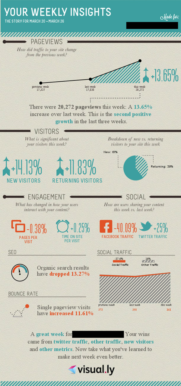
See a sample report below:
All in all, not too shabby. In our books, this new tool is a great way to keep tabs on your websites performance without really making the effort to discern and analyze the data in your Google Analytics accounts. We strongly suggest you give it a try!
Share
Recent Posts

July 3, 2025
Boost Business Efficiency with Google Workspace Automation Tools
Streamlining Your Business with Google-Based Automations Hey there, fellow business owners! If you’re like most of us, you probably feel like there just...
June 13, 2025
Harnessing Google Tag Manager for Better User Insights and Performance Tracking
Unlocking the Power of Google Tag Manager: Simplifying Tracking and Understanding User Behavior Hey there, fellow business owners! If you’re navigating the digital...

June 13, 2025
AI Max: Transform Your Google Search Ads Strategy Today
Unleashing the Power of AI with Google Ads’ New AI Max Hey there, fellow business owners! If you’re anything like us at Strong...